Layout
The layout of the GCS can be heavily customized by providing a layout file.
Where is this file?
The default layout file is in the app directory (File -> Open app directory) and is named default_layout.xml.
It can be changed in the app settings: File -> Edit settings -> General -> Layout.
General Layout
The layout file is an XML file with the root tag being layout.
The widgets can be organized in columns or rows recursively. This will create the needed layout with splitters between each widget (so they can be resized).
Widgets are instanciated with the widget tag. The name attribute define which widget is instanciated.
Note
columns, rows and widget can have a size attribute. This is a hint that may be overrided by widgets policies.
This example of layout features a map on the left, with strips and commands widgets at its right, organized in rows.
<layout width="1000" height="800">
  <columns>
    <widget name="map2d" size="800"/>
    <rows>
        <widget name="strips" container="list"/>
        <widget name="commands" icon="nav.svg"/>
    </rows>
  </columns>
</layout>
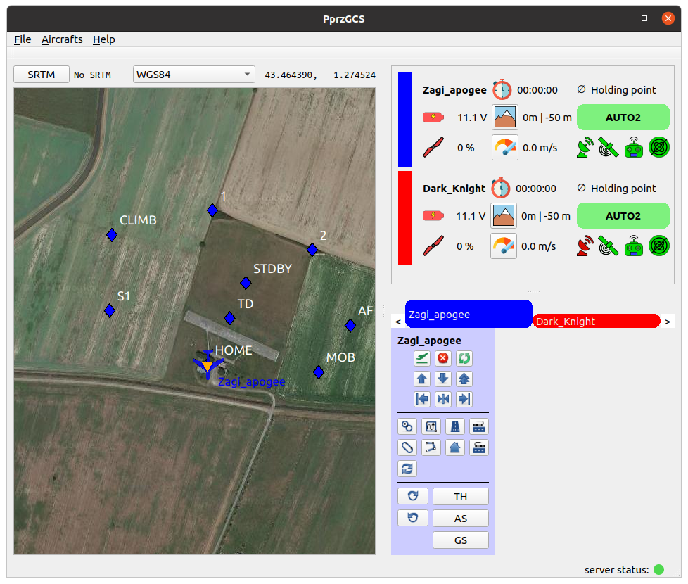
This is how this layout renders.
Containers
Some widgets such as the map handle all aircrafts at once, but some other only handle one aircraft.
They are then instanciated for each aircrafts, and placed together in a container.
This is configured by the container attribute, which can take two values:
list : This place the widget instances in a vertical list, with a color rectangle next to the corresponding widget.
stack : this place the widget instances in a “tab like” fashion. This is the default choice.
You can see how it renders on the example above.
Configure
Some widgets can have a configure tag. The syntax of this tag is widget dependant.
Map
The map2d widget features two columns at the left and right where buttons can be placed. These buttons open a widget next to it, over the map.
The configure node must contains two children: columnLeft and columnRight.
Those nodes contains widget nodes, with an additionnal attribute icon which specify the icon of the button.
Note
Icons must be in the pictures directory of the app or user directory.
An example of configure node for this widget:
<configure>
        <columnLeft>
            <widget name="layers" icon="map_layers_normal.svg"/>
            <widget name="commands" icon="nav.svg"/>
            <widget name="gps_classic_viewer" icon="gps.svg"/>
        </columnLeft>
        <columnRight>
            <widget name="PFD" icon="pfd.svg"/>
            <widget name="settings" icon="settings.svg"/>
            <widget name="flight_planV2" icon="flight_plan.svg"/>
        </columnRight>
</configure>
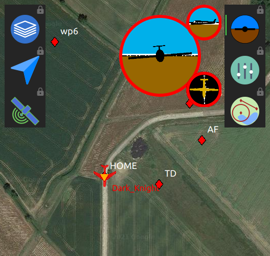
Configuration rendering, with the PFD widget opened
By default, opening a widget hide the other widgets in the same column. Widgets can be locked by clicking on the lock icon, at the top right of each button.
Note
Widgets in the map can also be configured!
Plotter
The plotter widget can be configured with the needed plots at startup.
The configure node contains plot nodes, with the mandatory attribute name describing the data to be plotted.
The name is contructed as follow: <class>:<message>:<field>.
class: message class (ground or telemetry).
message: message name
field: name of the field to be plotted
Optionnal attributes min and max can be added to configure the scale of the plot.
<configure>
        <plot name="ground:FLIGHT_PARAM:roll"/>
        <plot name="ground:FLIGHT_PARAM:alt" min="0" max ="500"/>
        <plot name="ground:FLIGHT_PARAM:climb" min="-3" max ="3"/>
</configure>